Killed by good intentions
This is a story about a treacherous crossing and a saint in the municipality that tried to make it better. Sadly, this hero with his good intentions failed in his quest and has created a more dangerous scenario that will kill someone in the future. Killed by good intentions.
I’m reading the excellent book “The 99% Invisible City: A Field Guide to the Hidden World of Everyday Design” by Kurt Kohlstedt and Roman Mars. I can’t recommend it enough, it is chock-full of beautiful insights in city planning and history, and it creates an excitement for all the things surrounding us in a city. Plus, it looks beautiful (I’ve tried to mimic some of their style in the illustrations, but I failed of course). The best thing about the book is that I now pay more attention to the city around me.
That’s robably why I noticed the crossing below…
The situation: four crossings (and a funeral?) #
My hip new job at PostNL is located in a hip building in a recently ‘hipped up’ part of The Hague. It’s all very hip.
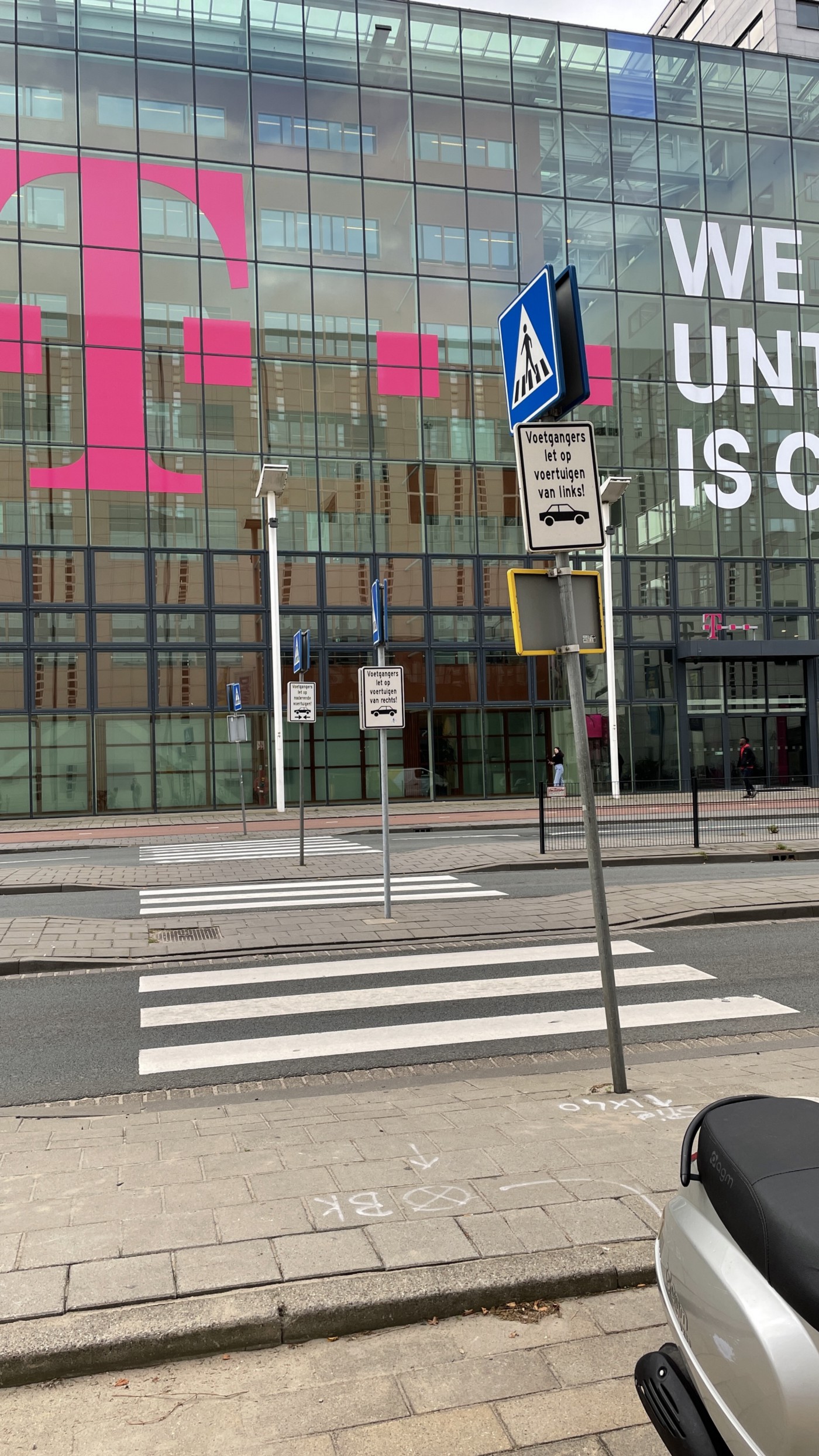
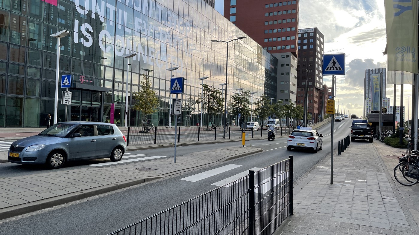
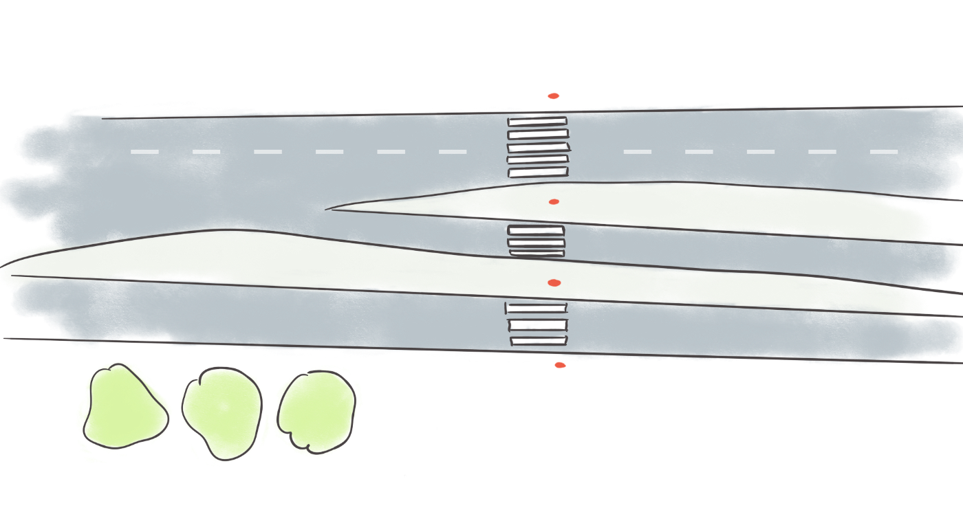
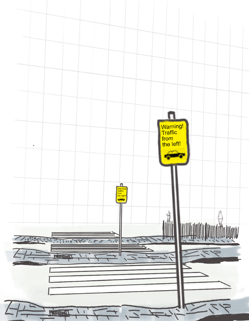
To reach my sparkly new office I have to cross four lanes of busy traffic. The four lanes are split into three roads with two ‘islands’ in the middle. Even though there are zebra-crossings to help me and my fellow pedestrians, the crossing is confusing: does the traffic come from the left or the right?
A clever city planner noticed this problem and provided a simple solution: signs!
Sadly, this elegant solution doesn’t work in the real world.
A killer solution #
So we have a dangerous crossing-situation and the clever (and cost-effective!) solution of placing signs. But the clever solution does not work because of the placement of the signs.
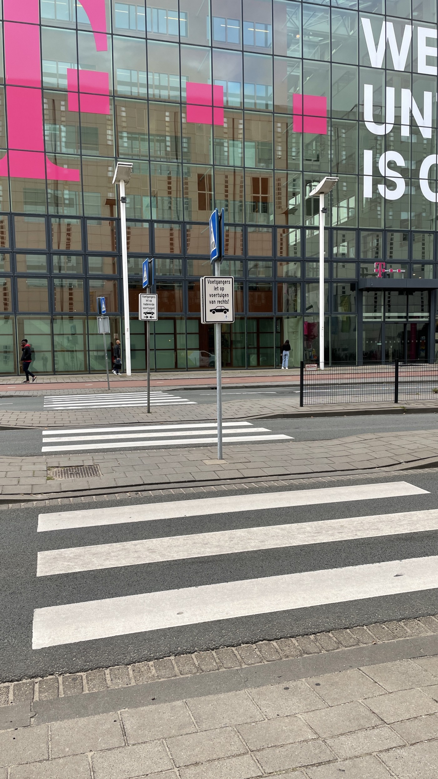
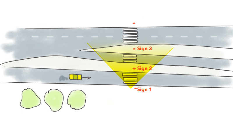
Here’s the overview again. I’m standing before the first crossing and I’m looking in front of me (my field-of-view is in yellow in the image). The sign I should be seeing is sign 1 (“watch out! Traffic from the left”), but instead I see sign 2 (“Traffic from the right”) in my field-of-view:
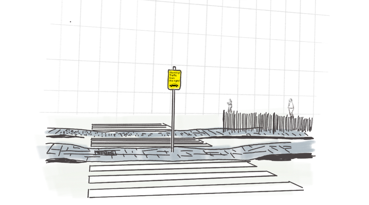
Here’s what that view looks like:
The first time I approached the crossing, I didnt look left and right like I normally do (because of the sign), but only looked to the right-hand side. Which was the wrong side, because traffic comes from the left. Luckily the driver in the car was paying attention and stopped on time!
This problem mainly exists because we approach the crossing over the sidewalk next to the road (instead of head-on). As you can see in the image below, the first sign is very easy to escape your attention:
You need to take a few big steps back to see the proper sign. Who do you think would do that? That’s right: nobody.
Where to go from here? #
Good intentions led to placing these signs, but the result is an even more dangerous situation. Our ‘intervention’ brought confusion. What can we do?
The simplest solution I can come up with is to remove the signs. This way we let our pedestrians think for themselves again. The better solution would be traffic lights, but this is also expensive… If we are keen on keeping the signs, they should be placed lower, on eye level.
Lessons learned #
This is a story about a failure in city planning, but this story is applicable to the software-world as well. Any design-intervention, even the ones with the best of intentions, can have undesired consequences.
These are the type of good intentions that will get you killed.
To prevent such failures always test your design-interventions in the real-world! Test them before implementation (in a usability-test with a working prototype) and then test them again after implementation.
The real world can be cruel for us designers/city-planners with our good intentions.
Stay safe 😎
(I’ve reported the dangerous situation to the municipality. UPDATE: they don’t see a problem, “the signs are hanging as they should be”…)
The photos #
I realize that my illustrations are definitely not as good as the ones in The 99% Invisible City, so here are my photos.
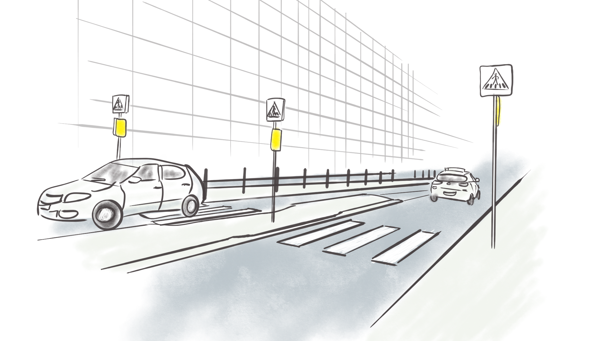
Here’s what we should see… (sign says “cars approaching from the left”):