We have a Design System: let’s fire our designers!
Most design systems focus on in-page interactions: visual elements, motion, accessibility, tone-of-voice, etcetera. They keep your websites neat and consistent in wording, style and components. But that doesn’t automatically mean you’ll have a good product.

Good visuals, bad experience #
Imagine two sites created with the same design system, but having completely different experiences for the people visiting them. The one site feels familiar and friendly, the other cold and distant. One site answers the questions you have right when you need that information, the other just boasts about all the cool stuff the company ever did — leaving you to hunt around multiple pages finding simple answers. And even though both sites use the same buttons, icons and colors as the app and the email-newsletter, only one of them feels the same as that other stuff — the second site feels like completely different people made it.
Imagine you’d have to choose which one to use? For which product would you happily pay to use?
People don’t care about your components #
People using your product or visiting your website are not looking at components, they are looking at the entire page. More than that: they look at multiple pages on your website and at different pages at different times…
And it’s not just your website! Your website visitors will hop between support-documents, live-chat, marketing-pages, your app and many other ‘touch-points’.
This happens in real life #
It’s easy to point to bad sites and apps that use “good elements”: many websites use standard component-libraries like Google Material or Bootstrap and still completely screwed up on basic usability and content.
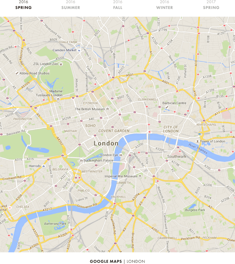
Another example is Google Maps. In just a year time they created a completely different experience using exactly the same elements. It wasn’t bad (not by far!), it could just be better:
More documentation is not the answer #
Design systems focus mainly on implementation and development of components and templates: visuals, layouts, colors, motion, code, etc. Design systems focus on “how”, usually not on “why”, “when”, “who” and “where”, or: “can we?”, “should we?” and “what if?”
Can we solve this with documentation? I don’t think so.
Just stuffing everything in your Design System is not the answer. The answer is to focus on interaction-design, service design, research and communication.
Having a Design System is great. But you still have to do the heavy work. #
I’ve heard people say: “now that we have a Design System we can skip the design fase and our developers can just implement new features directly”. I disagree :)
Design is about creating a great experience for people. To do that, you’ll need to align with development, sales, marketing, management and others, and you need to do a lot of (user-)research.
Having a Design System saves time so you can do all that. It also helps you create better and more consistent end-results. Design Systems are great, just not the holy grail or a panacea.
With Design Systems being more common place, websites will be more consistent and beautiful. This means you can’t rely purely on having great visuals, you’ll have to raise the stakes and focus on how your components are used.
What is your website trying to say?