A quick review of Webexpo Prague 2013
This article is also published in the Angi Studio Medium collection
In 2013 I visited Webexpo in Prague. A conference about the web that mixes design, business, life hacking and IT. It was the first time that the conference reached out to foreigners, by inviting international speakers and making all talks in English. I had fun and learned a lot, but: is it worth attending again next year?
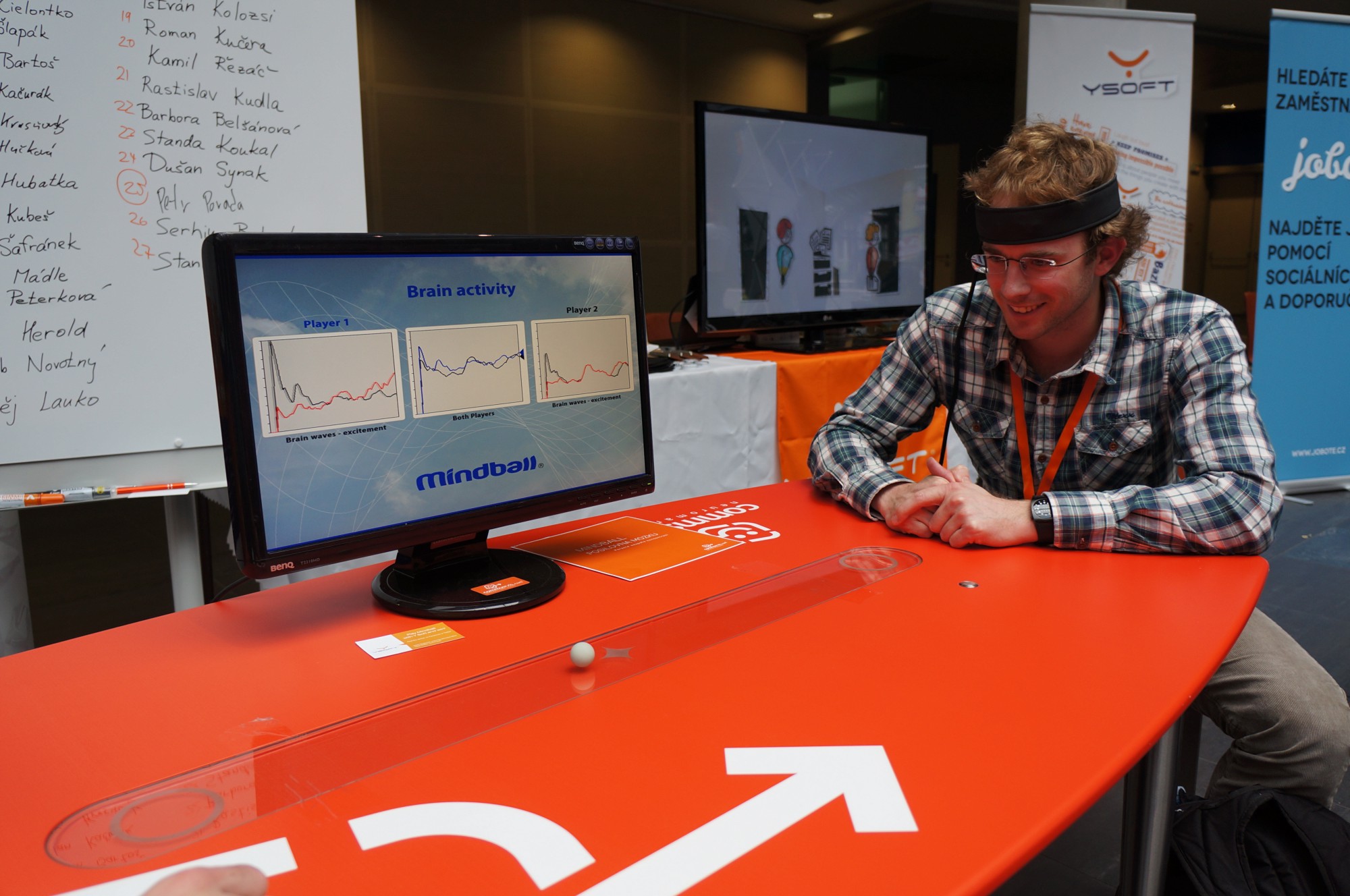
The mix of design, business and IT was very welcome. I learned most from talks outside my own area of expertise. That’s also what attracts me in interaction design: talking with clients and users, and learning new things from different subjects. I talked with everybody in the conference, from the speakers to the guy making the tea. The conference had a very open and relaxed atmosphere and there were several cool things besides the talks such as: 3d printing, Google Glass, and even a professional masseur. Another neat idea was the discomfort zone, where people were allowed to debate freely and play devils advocate without consequences. Also great were the after-conference parties and events. Sadly, the design workshop on Thursday didn’t happen due to lack of attendees.

So what about the talks? #
The quality of the talks was very good overall. But it seemed that every design or business presentation has lists of “ideas”, “key takeaways”, “guidelines” or “insights’. A lot of them seemed trivial or made up on the spot (“listen to your users”, really?). It would have been better for most talks to stick to one message! Now, I’ll break that rule straight away and present some take-aways :)
A great story is better than a 1000 words #
Marli Mesbov gave a great presentation on the importance of story telling. Stories work better than short tag lines, which is probably related to Key Take Away 1 (no take-aways).
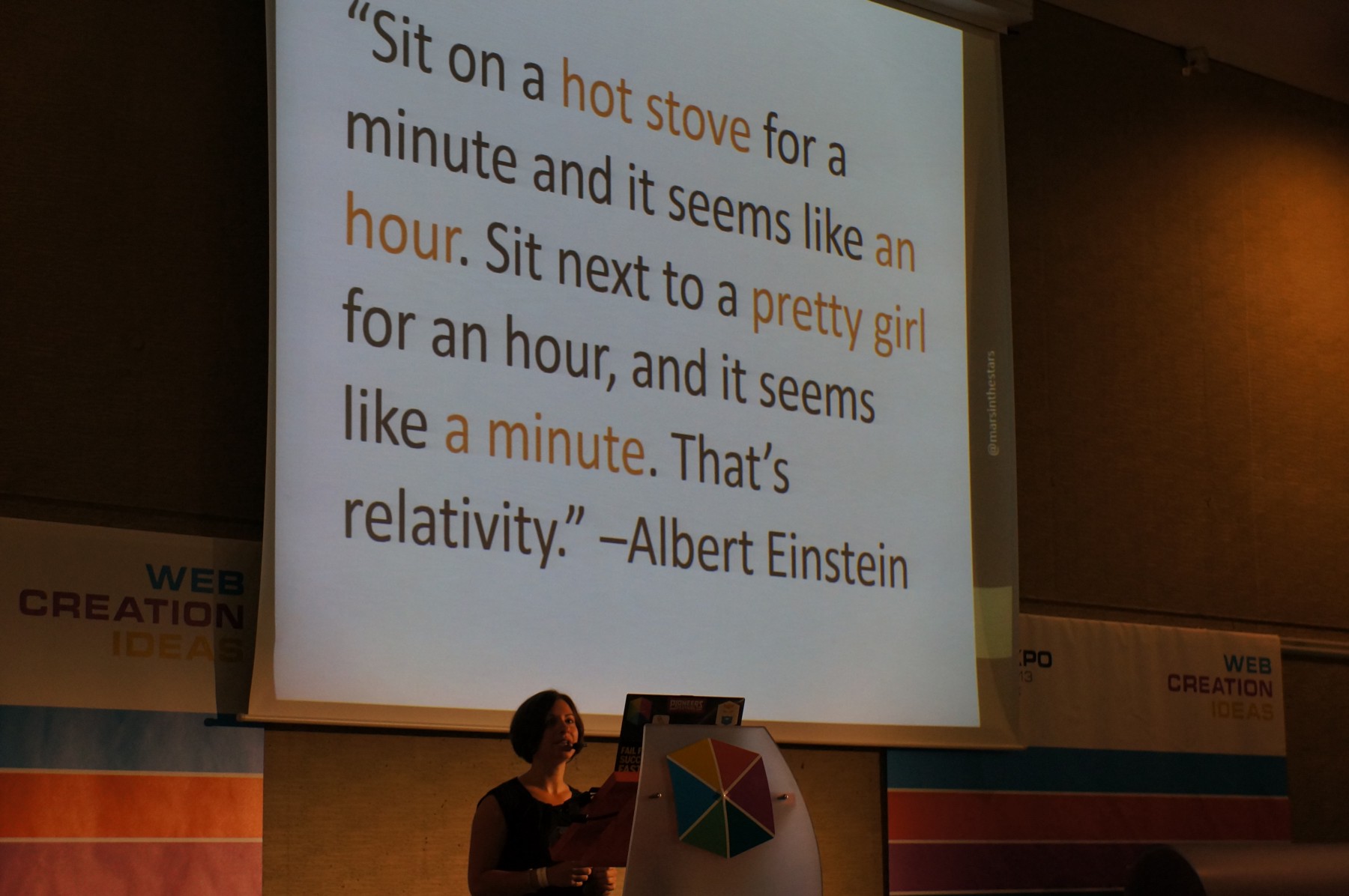
Stories work for conversion and for your clients to positively remember you. Do you remember the fairytale of the boy who cried wolf? Don’t you think that carries the message better than “don’t alarm us for nothing”? The average attention span went down from 12 seconds in 2000 to a mere 8 seconds in 2012, so better make your story captivating!
Besides working on your site, stories also work great for doing design. It’s an old saying, but still good advice: instead of designing for users, design for a story.
Lastly, a story can be used to instruct a client on how to use the website. Instead of delivering a 100 page styleguide which people don’t read, you can make a short story, a trailer or just a word (“dictionary”, “phonebook”), which ’explains’ the site to the client.

Our terms suck #
It was great to hear some self-conscious critique on terms we use within the field. Our terms are confusing and their meaning differs per person and company: UX, service design and even interaction design (but less). Some people include visual design in there, programming, marketing… All very confusing! And what to think of terms like ’expert’ or ‘guru’? Instead, it’s better to describe what you do and how it benefits the client or project.
Death by a million paper cuts #
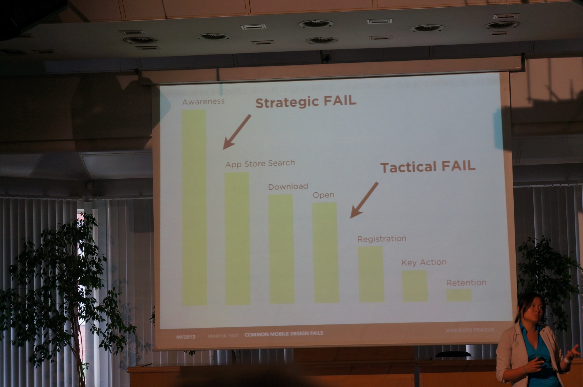
Bad user experience costs money, which is what we tell our clients also But it was great to see some examples, such as Expedia losing 12 million dollar because of a form field or Best Buy losing 300 million dollar by requiring an unnecessary login. This holds especially for mobile use: a lot of apps are used only once or thrown away within a month. Avi Itzkovitch had some nice examples how to overcome such bad experience by making more use of context. For instance by adapting the interface based on location, time of day or usage pattern.
So, should you visit next year? #
I wish it could be a wholehearted yes! I had a lot of fun, met great people and
learned a lot, but.. Some things nagged a bit, like the cancelled design
workshop, the open doors in some design talks and the endless lists of
recommendations. Another thing is the overlap in the program: breaks were
different for each track making it difficult to switch. That might be why
designers mostly went to the design track and programmers to the development
tracks, making the mingling a lot less. On top of that, all speakers were “safe
choices”, nobody went really overboard or crazy with some thought-provoking
talk. Still, it was fun and I learned useful things, so, I guess it’s four out
of five stars.
For a visual impression, see the Facebook
photostream

Talk guide: #
Webexpo puts the talks online (very slowly), so which ones should you see?
- Marli Mesbov: how to construct and use a story - INSIGHTFUL
- Riki Fridrich: how to get to the job you want - INSIGHTFUL
- Jesse James Garrett: design for engagement - INSIGHTFUL
- Mariya Yao: design tips for mobile apps, very nicely supported with numbers - INSIGHTFUL
- Avi Itzkovitch: you can change the UI based on sensor data, by adapting to the user context - PRETTY INTERESTING - but skip through it first, to see if it’s your thing
- Eirik Hafver Rønjum: designing the organization - NICE - but toooooo long, so skip through it a bit
- Steve Corona: scaling websites is easy - Matthijs’ stamp of approval
- Petr Kosnar: you see the weirdest things if you pretend to be a 14 yro girl on Facebook - Matthijs’ stamp of approval
- Ron J Williams: rethink your marketing strategy - Matthijs’ stamp of approval
- Vojta Rocek: having your own bar does not make you happy - Matthijs’ stamp of approval
- Tomas Slavicek: being a digital nomad is pretty awesome - Matthijs’ stamp of approval
- Jiri Sekera: on the term UX - FUN
- Wolf Becvar: identify customer touchpoints - OKAY
- Jean Trojan: what does it mean to be a guru or expert - MWOAH, I think sometimes ’expert’ makes sense, especially inside a company
- Sabrina Majeed: when to use guidelines and when not - MWOAH - a lot of open doors, packed with some great content, if it was shorter would have been okay
- Wodtke, Bermes, Abley: I haven’t seen them, but recommended by others
This article is published in the Angi Studio Medium collection