Slideshare.net and Squirrel

Hi all, it’s time to start blogging again ;)
Today we have two confusing interfaces. These are the financing application for OSX called “Squirrel” (https://www.squirrelapp.com/) and a website for sharing slides (https://www.slideshare.net). Both are nice applications! But I’ve been confused by their use of very simple symbols. Maybe you won’t be confused, but remember that you’re in the mind-set of things being different than they seem ;)
First, slideshare:
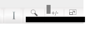
Which button is for zooming in? :) I’ve blocked the text, so think first about it before seeing if you guessed correctly
I got confused multiple times. Especially if you don’t think about wanting to search through slides. All the items on this page are related to the current slide, not for searching a specific text… (Update: they’ve changed it now, and ditched both zooming and searching)
Next, Squirrel:
Squirrel is a nice application with which you can manage your financials. It can import from your bank, but sometimes you have to add a transaction by hand. In the image below, I wanted to schedule a monthly transaction. But money can go both ways of course: it’s either added to my account, or subtracted. So which button do I check if the money comes to me?? Did I check the right button, or did I check the outgoing-money button?
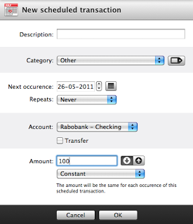
Again, I was really confused! I actually made a mistake with this that took me over an hour to figure out! :D Actually, the rest of the program is using color coding to avoid such mistakes. You’ll find the solution to the earlier question by looking at a different part of the interface.
Solutions #
Symbols are always difficult. Include a text-label always, or use conventions. Even that doesn’t guarantee usability: slideshare was doing both! In that case, I would suggest removing the search-button and adding a search-field (similar to how the top-right of your browser looks, most likely). In the case of Squirrel there definitely is color coding needed! But even better would be to just use the “+” or “-” symbol. This is just confusing :)
Ps: Mac-users, I can really recommend Skitch to you! It’s great for making screenshots!