Bank mailbox

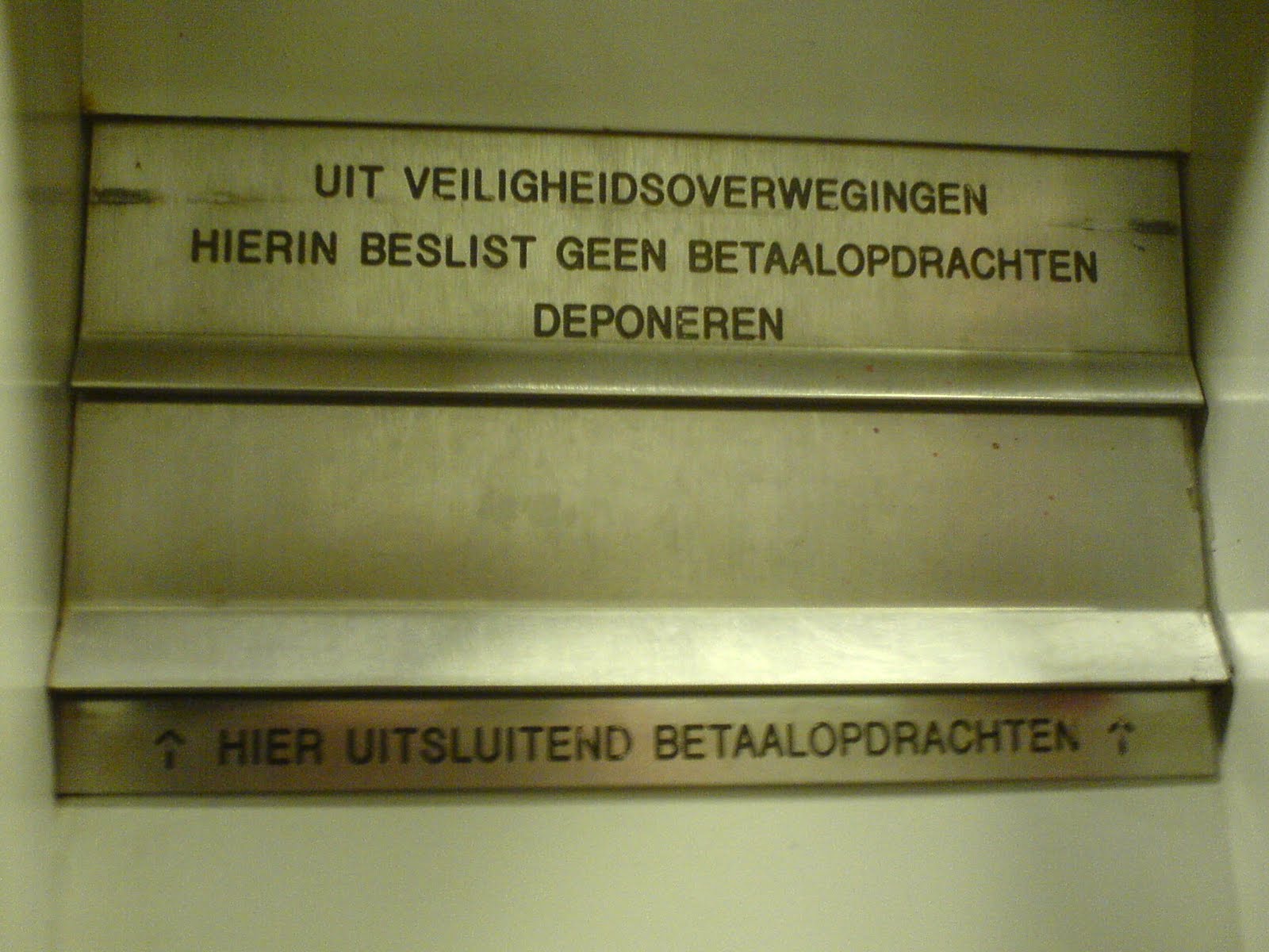
This is a rather confusing mailbox for a bank in the Netherlands. The top text states that for security reasons one should really not put payment transaction forms in “here”, the bottom text says “here” is only for payment transaction forms (with arrows pointing upwards). The problem with this is that there only is one mailbox: the top one is bolted shut and thus looks like it is just a sign.
Solution #
The two mailboxes serve a different purpose, one is an actual mailbox, the other a deposit for payment transaction forms. One of the possible solutions is to more clearly separate the mailboxes. For instance, put them on the same horizontal plane with some space in between. Or put the normal mailbox near the main door and the transaction-form mailbox near the payment machine, those might be more ’natural’ locations.